That approach works impressively well when the question is precise. It stumbles, however, when the goal is exploration, comparison, or simple discovery. Search engines were built to retrieve needles. Browsing, on the other hand, exists to understand haystacks. Confusing these two modes has quietly reshaped how people use the web—and not always for the better.
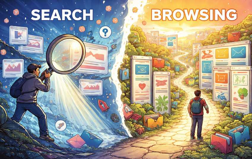
Search Is a Sniper Rifle
Keyword search is designed for accuracy. When someone types “best noise canceling headphones under $200,” the system’s job is to produce targeted results as fast as possible. This is excellent for transactional tasks, troubleshooting, and factual lookups. The user already knows what they want and just needs directions to it.Browsers lean heavily into this mindset. The address bar doubles as a search box, suggestions auto-complete half-formed thoughts, and entire pages are pre-ranked by relevance signals. Efficiency is the star of the show. A clean answer appears, everyone nods, and the browser moves on to the next request like a caffeinated assistant with a clipboard.
There is a downside to this precision. Search narrows attention. It pushes users toward a small cluster of highly optimized results and away from alternative paths. When the query is wrong, incomplete, or vague, the output can feel oddly confident while being only partially useful. A sniper rifle aimed at the wrong target still fires accurately—it just hits the wrong thing very well.
Browsing Is a Map
Browsing works differently. Instead of asking a direct question, the user enters a structured environment: categories, tags, filters, or curated lists. Think of online stores, academic archives, media libraries, or recipe sites. The value here is context. Items are grouped by shared traits, making relationships visible instead of hidden behind keyword matches.This mode supports learning and comparison. Someone looking for a new hobby might not know the right keywords yet. Browsing “Arts & Crafts,” then “Woodworking,” then “Beginner Tools” reveals options that would never appear from a vague search like “fun projects.” The user gains orientation before making decisions.
For serious research tasks, this structure matters even more. Historians, students, and professionals often rely on categorized collections because they show scope and boundaries. Browsing makes it possible to see what exists, not just what was asked for.
Why Browsers Prefer Search Anyway
Search is easier to standardize and monetize. It fits neatly into ranking algorithms, ad placements, and instant gratification metrics. Browsing requires thoughtful information architecture, maintained taxonomies, and interfaces that encourage patience. That is harder to automate and less flashy in performance dashboards.As a result, many browsers and platforms quietly de-emphasize structured navigation. Menus shrink, category pages disappear, and everything funnels back to the search box. The web becomes fast, efficient, and slightly disoriented at the same time.
When Each Method Actually Shines
Search and browsing are not rivals in a digital boxing ring. They are tools with different strengths, and the trick is knowing which one to grab.Search performs best when the destination is clear and the path is short. Browsing excels when the destination is unknown and the path itself provides value. Practical examples make this obvious:
- Looking up a specific error code or definition favors keyword search.
- Choosing a new streaming series benefits from browsing genre lists and curated collections.
- Shopping for a replacement charger works well with search.
- Comparing camera models or travel destinations improves dramatically with category filters and side-by-side browsing.
Structured Lists Are Quietly Powerful
Organized lists may not look glamorous, but they carry a hidden advantage: they reduce cognitive strain. Instead of inventing keywords, users respond to visible options. Categories create a shared language between platform and visitor. Filters turn overwhelming catalogs into manageable sets.There is also a trust factor. A well-designed list signals curation and intent. When users browse a library of topics, product categories, or learning paths, they sense that someone thought about structure rather than relying solely on ranking formulas. That perception matters, especially in spaces flooded with near-duplicate content.
From an accessibility standpoint, browsing structures also help users who struggle with precise search phrasing. Clear navigation paths provide multiple entry points instead of demanding perfectly typed queries. This is not nostalgia for old websites with massive sidebars. It is recognition that human thinking often starts broad and becomes specific later.
Clicking Around the Block
Browsers have become extremely good at answering direct questions. They have not become equally good at supporting wandering curiosity, comparative thinking, or slow exploration. That imbalance shapes online behavior in subtle ways: shorter sessions, narrower exposure, and decisions made from thinner context.A healthier web experience allows both modes to coexist without one trying to swallow the other. Search should remain fast and precise. Browsing should remain visible, structured, and easy to enter without feeling like an optional side quest hidden behind three menus and a tiny arrow icon.
When structured lists are treated as first-class citizens instead of decorative leftovers, users gain orientation, platforms gain engagement rooted in understanding, and the browser stops behaving like a speed-only machine. The result is not slower navigation. It is smarter movement, with fewer wrong turns and fewer “why did I even click that” moments.
Article kindly provided by directory.top