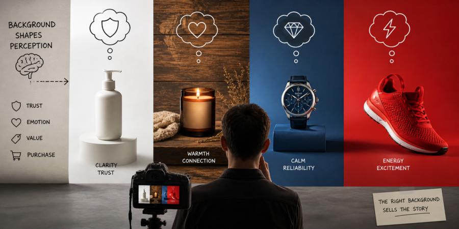
White Space and the Illusion of Honesty
Clean white backgrounds are the visual equivalent of a firm handshake and steady eye contact. They suggest transparency, simplicity, and order. When a product sits alone on white, nothing competes for attention. There are no hidden corners, no distractions, no suspicious shadows that make viewers wonder what’s being concealed.E-commerce platforms rely heavily on this approach for a reason. It reduces cognitive load. The viewer doesn’t need to decode context; they can focus entirely on the item. That efficiency builds trust. It signals that the brand has nothing to hide, even if the product is just a coffee mug trying its best to look like a life-changing experience.
There’s also a subtle psychological cue at play. White backgrounds mimic clinical environments and catalog imagery, both associated with precision and reliability. When used correctly, they elevate perceived value without adding a single feature to the product itself.
Texture and the Comfort of Familiarity
Introduce a textured background—wood grain, linen, stone—and the entire mood shifts. Suddenly, the product exists in a world rather than a vacuum. It feels lived-in, approachable, and human. This matters because people don’t buy objects; they buy experiences attached to those objects.A candle photographed on a rough wooden table doesn’t just promise light. It suggests evenings, warmth, and the illusion of having one’s life together. Texture adds narrative without needing words. It provides context that the brain quickly translates into emotional cues.
There’s also an element of sensory imagination. Rough surfaces hint at touch, soft fabrics suggest comfort. Even though viewers can’t physically interact with the product, their minds fill in the gaps. That mental participation increases engagement, which often nudges buying decisions in a favorable direction.
Of course, there’s a balance to maintain. Too much texture, and the product starts to feel like an extra in its own photo. Nobody wants their carefully designed watch overshadowed by a table that looks like it has a backstory more interesting than the product.
When Backgrounds Compete Instead of Support
Not all backgrounds are helpful. Some behave like uninvited guests who rearrange the furniture and then ask for compliments. Overly complex scenes can dilute the product’s message, forcing the viewer to work harder to understand what’s being sold.Clutter introduces ambiguity. Is the focus the product, the setting, or the lifestyle being implied? When the answer isn’t clear within a second or two, attention drifts. In a marketplace where attention spans are already fragile, that drift is costly.
The goal isn’t to impress with scenery. It’s to guide perception. Backgrounds should frame the product’s story, not rewrite it entirely.
Color as a Shortcut to Emotion
Bold backgrounds operate differently from white or textured ones. They don’t whisper. They announce. A bright red backdrop can inject urgency and excitement, while deep blues lean toward calm and reliability. These reactions aren’t random; they’re rooted in learned associations and cultural patterns that influence how quickly people form judgments.Color also acts as a sorting mechanism. Viewers scanning a crowded feed are more likely to pause when a strong hue interrupts the visual rhythm. It’s the digital equivalent of someone wearing neon in a room full of beige. Subtlety has its place, but boldness gets noticed first.
That said, color is not a free pass to chaos. A mismatch between product and background tone creates friction. A luxury watch placed against a loud, playful color might feel less refined, even if the watch itself hasn’t changed. The background sets expectations, and if those expectations clash with the product’s identity, trust erodes quietly.
Context Shapes Perceived Value
A product doesn’t exist in isolation in the mind of a buyer. The surrounding environment helps define what it’s worth. Place a simple object in a minimal, high-end setting, and it inherits some of that perceived sophistication. Move the same object into a cluttered or low-quality environment, and its value appears to drop.This effect is subtle but consistent. Backgrounds act as signals, telling viewers how to categorize what they’re seeing. Is this practical or indulgent? Everyday or premium? Disposable or lasting? The brain answers these questions almost instantly, often before the product details are fully processed.
Consider how brands stage items differently depending on their target audience. A fitness product might appear against a gritty, industrial backdrop to suggest intensity and discipline. A skincare product might float in a soft, pastel environment to evoke calm and care. Neither choice is accidental. Each one nudges interpretation in a specific direction.
Consistency Builds Recognition
Background choices don’t just influence single purchases; they shape long-term brand perception. When a brand consistently uses a particular style—clean white, warm textures, or bold colors—it becomes part of its visual identity. Over time, viewers begin to recognize the pattern, even before noticing the logo.Consistency reduces friction. It tells the audience what to expect and reinforces familiarity. That familiarity can translate into trust, and trust often shortens the path to purchase. People are more comfortable buying from something that feels known, even if they can’t immediately explain why.
There’s also a practical side. Consistent backgrounds make product lines feel cohesive. A collection presented with varying styles might look disjointed, as if each item belongs to a different story. A unified approach ties everything together, giving the impression of intention rather than improvisation.
- White backgrounds signal clarity and reduce mental effort
- Textures introduce warmth and narrative cues
- Bold colors capture attention and drive emotional response
- Consistency strengthens recognition and trust
Behind the Scenes Thinking in Plain Sight
Backgrounds may sit quietly behind the product, but they’re doing active work. They guide interpretation, influence emotion, and shape perceived value in ways that viewers rarely notice consciously. That quiet influence is exactly what makes them powerful.A well-chosen background doesn’t beg for attention. It supports, frames, and occasionally nudges the viewer toward a conclusion that feels like their own idea. And if a plain white backdrop convinces someone that a water bottle is the pinnacle of modern design, it’s probably earned a small round of applause behind the scenes.
Article kindly provided by gdholland.co.uk